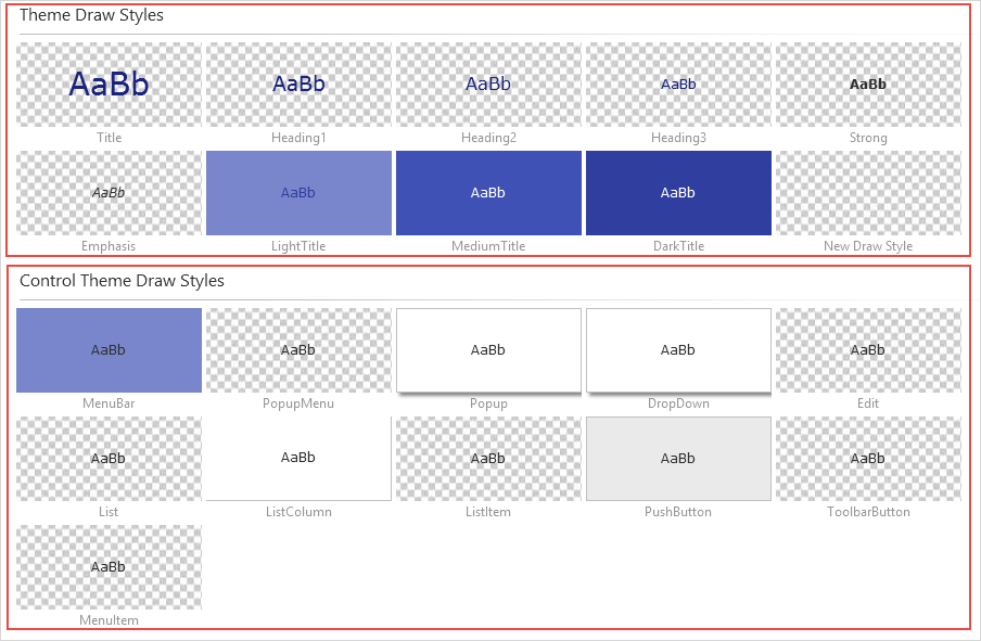
After defining the global theme, you can set specific draw styles. Switch to the Draw Styles tab in the ribbon:

There are two kinds of draw styles:

Theme Draw Styles are abstract draw styles such as Title, Heading 1, 2, 3 and so on. These predefined names exist by default in all basic system themes. They have no particular meaning as such.
Control Theme Draw Styles apply specifically to the default appearance of controls. Thus, the Edit draw style applies to all input boxes such as fields and spin edits; List Item applies to all entries in the List control; Menu Item applies to menu items and so on.
Every draw style has features which are set in the Style tab on the ribbon:

|
For example, to change the default MouseOver color for all push buttons in an application, you simply select the PushButton draw style and the MouseOver style, and then set the Fill color.