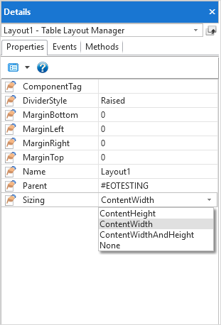
The biggest single addition to the language for responsive design is a new sizing model: Layout managers can be used to size a control based on the size of its contents.

Until this enhancement, the bounds of the control defined its size. If the content did not fit - for example when the text was too long for a button - it was truncated. Now you can specify that the button is resized to the width of the text so that the button immediately resizes if the text changes.

Additional margin properties have been added where necessary to allow for internal spacing.
Web Pages and Lists without Scroll Bars
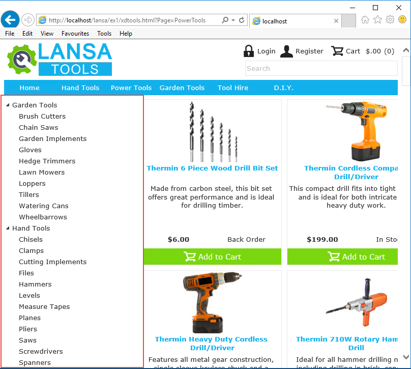
This new feature simplifies the creation of variable length web pages: the width of a control can remain fixed while the length increases, automatically increasing the length of the page. Used in conjunction with the Flow features of table layout, designing complex, multicolumn pages is now very simple.
Variable sizing is also supported by lists, so adding entries can make the control longer rather than showing a scroll bar.

The variable sizing features are also in operation at design time.