Much of power of graphical user interfaces is based on the fact that visual patterns are quicker and easier to recognize than text.
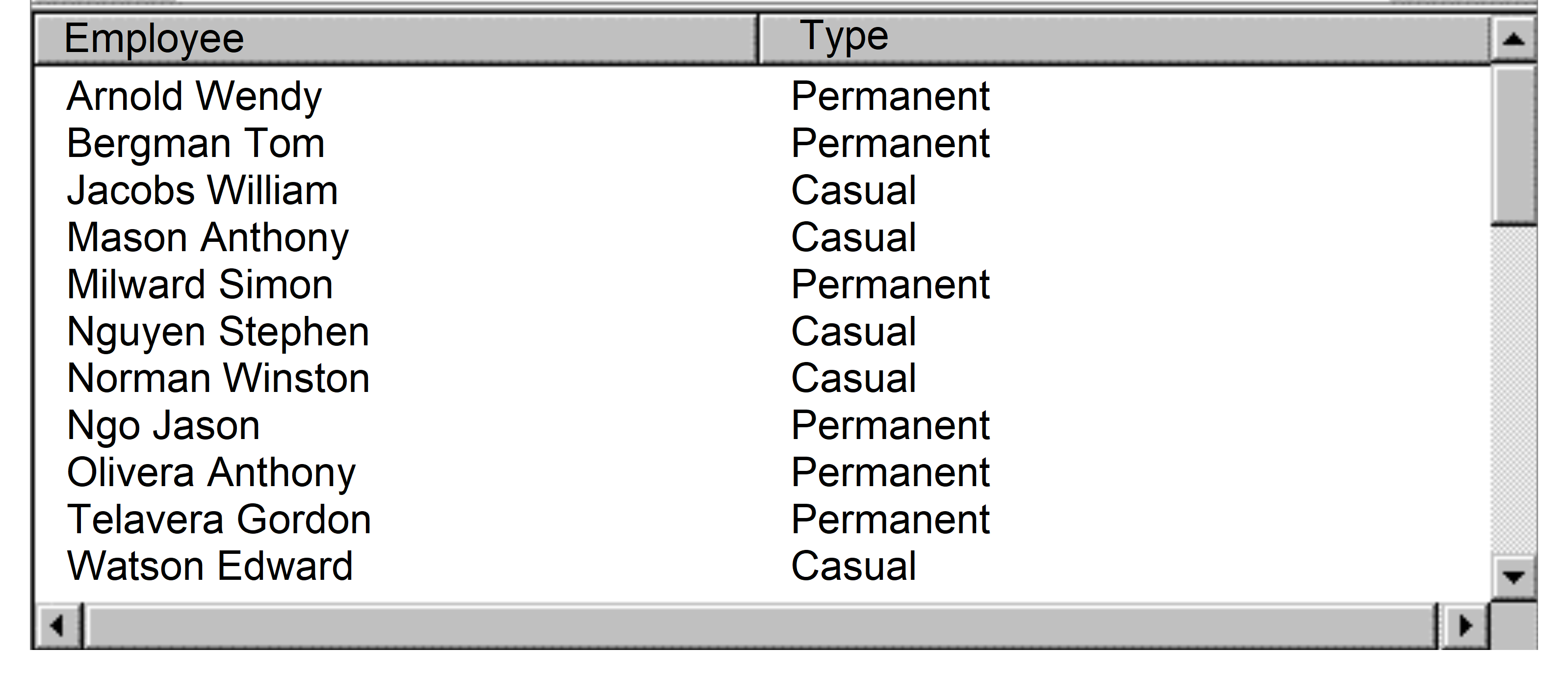
Let's say you have a list of employees, some of them permanent, others are casual and you need to show them in one list. Most developers would create a list like this:

There is nothing wrong with this list as such. However, to find out whether an employee is permanent or casual, the user needs to read the information in the Type column.
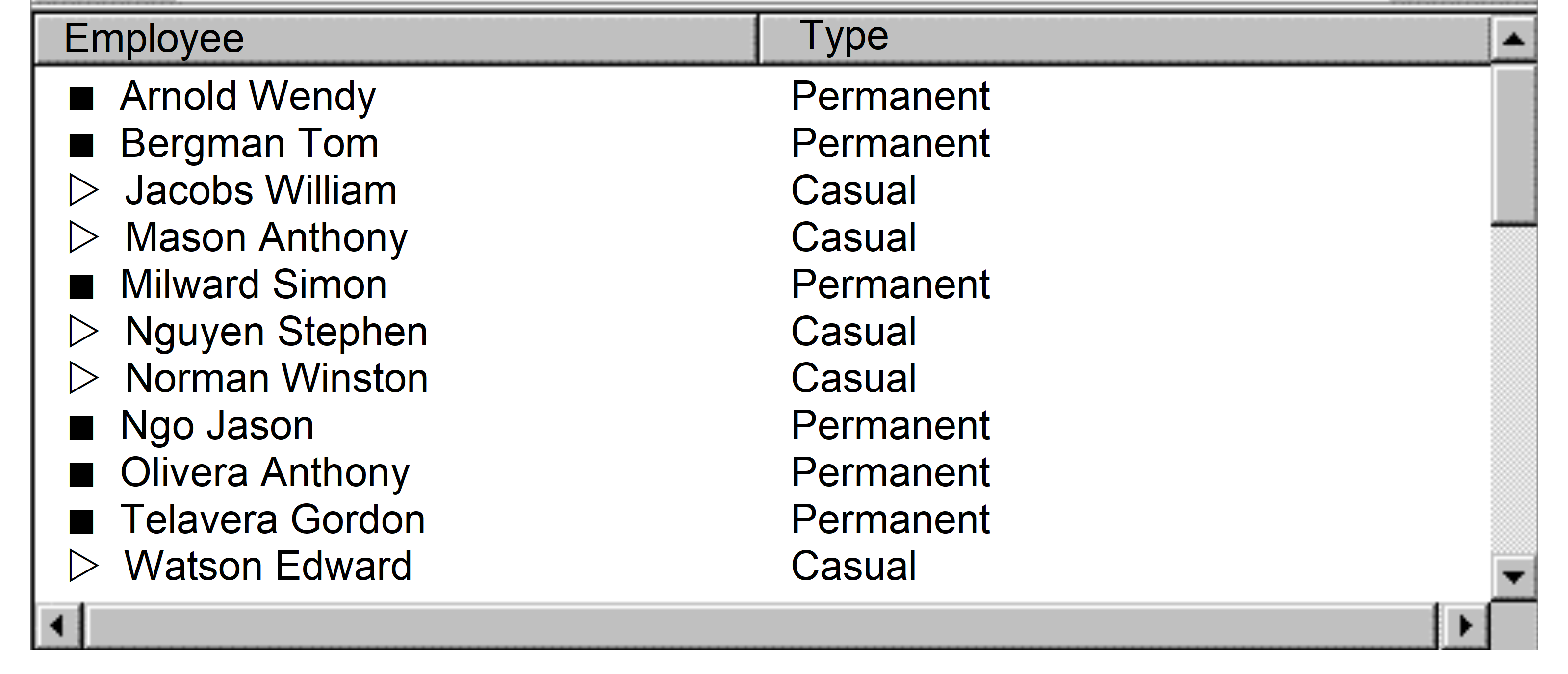
If the type of employment was identified visually, the user would be able to distinguish the permanent and casual employees at one glance.

In this example it can be seen straight away that there are two different types of employees.
The icons used are arbitrary, but a frequent user will quickly learn to associate the icons with the type of employee.
If you wanted to, you could try to find more representative icons. However, it is often hard or downright impossible to find icons that can communicate a meaning in an unambiguous manner, especially as most icons used in interfaces need to be very small.