Themes are repository objects and are selected when you use the LANSA Editor.

Base Theme
The base theme is one of the LANSA supplied themes used to define the colors in the color palette.
When a base theme is selected the colors in the color palette will be updated, overwriting any specific changes to colors that have been applied.
Color Palette
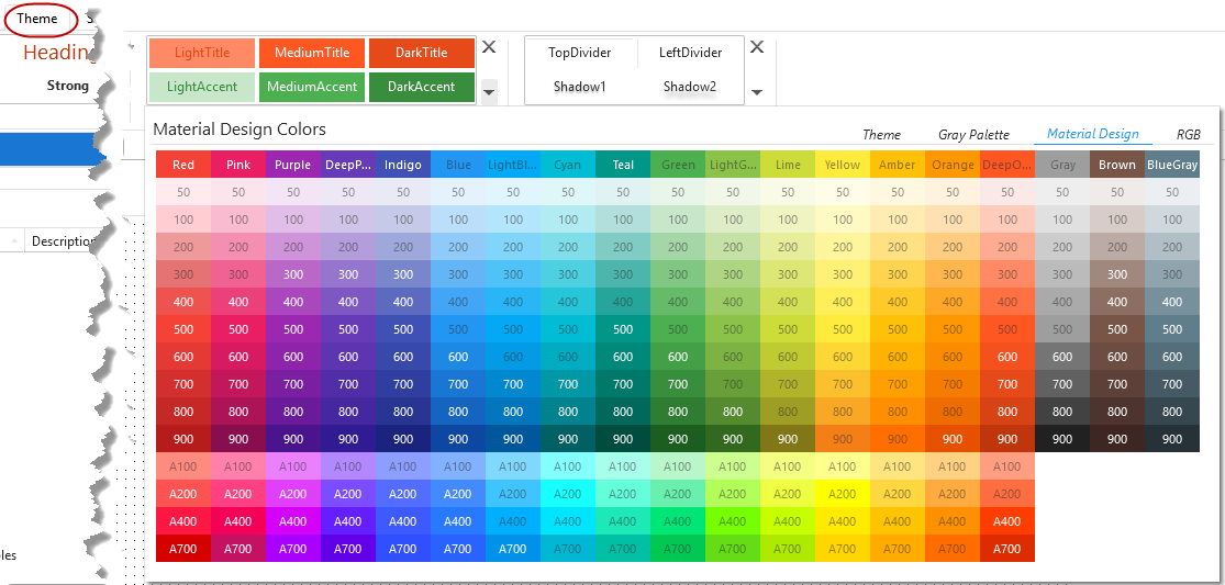
The colors in the palette provide a basic set of complimentary colors. These are based loosely on the Google Material Design guidelines.

Colors 50 - 900 and the 4 accent colors, A100 – A700, are used in many places throughout a LANSA applications and are not intended to be changed on an individual basis. Rather, the Base Theme will provide a starting point and all additional color requirements should be managed via the creation of additional Draw Styles or the modification of the supplied Draw Styles.
If colors are changed, they should all be changed such that they follow the transition from light to dark as per the system themes. This will ensure a correct appearance in the application.
The named colors have specific global uses and can be changed as required
Background
The background color of the main web page.
Inactive is the color used for selected and focus list items when the list is not the focus control.
Disabled is used for controls that are enabled False.
Text is the default text color.
Border is used as the default color whenever a border is specified.
Line is the color of the vertical and horizontal lines in a list.
These are global settings, however they can be overridden by individual Draw Styles.
Font
This is the base font that will be applied throughout the application. LANSA will default to Verdana for all VL-Web applications, but it is recommended that a font be specified.

Border Thickness and Corner Radius
These settings control the default appearance of the control that defaults to having a border, for example, List and Edit.
