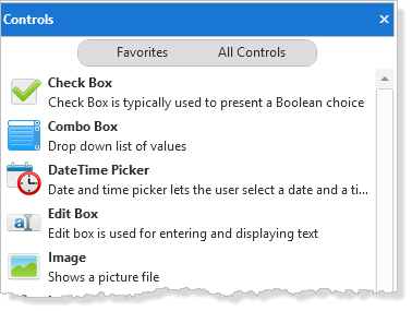
A user-defined control is a special kind of reusable part for displaying list-type information. It offers more flexibility to the designer than predefined controls such as the tree view or list view controls.

User-designed controls can only be used with applications which are run in DirectX mode.
The Visual LANSA user-designed controls are:
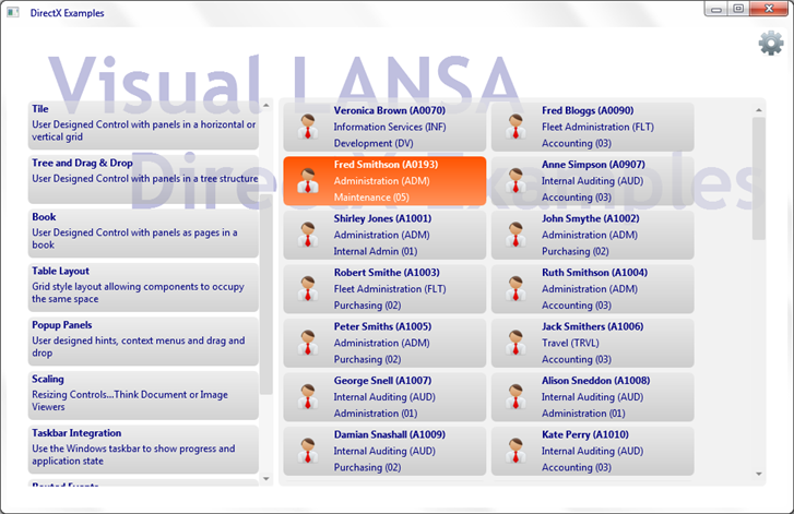
To see examples of the user-designed controls run the DirectX demonstration application (it is launched from the Partition Initialization dialog):

User-designed controls behave just like the other list controls, and obey the same list processing rules as tree view, list view and grid. For example they can be manipulated using the typical list commands such as Add_Entry and Upd_Entry, and respond to focus, selection, MouseOver and all the other typical events associated with visual list controls.
However, they have no defined appearance, in other words their design is user-designed.
For a predefined list view (Prim_ltvw) control, the definition in the source might appear as follows, with columns defined to indicate the data being used:
Define_Com Class(#PRIM_LTVW) Name(#LTVW_1) Columnbuttonheight(19) Componentversion(2) Displayposition(1) Fullrowselect(True) Height(342) Keyboardpositioning(SortColumn) Left(9) Parent(#COM_OWNER) Showsortarrow(True) Tabposition(1) Top(11) Width(680)
Define_Com Class(#PRIM_LVCL) Name(#LVCL_1) Displayposition(1) Parent(#LTVW_1) Source(#EMPNO)
Define_Com Class(#PRIM_LVCL) Name(#LVCL_2) Displayposition(2) Parent(#LTVW_1) Source(#SURNAME) Width(27)
Define_Com Class(#PRIM_LVCL) Name(#LVCL_3) Displayposition(3) Parent(#LTVW_1) Source(#GIVENAME) Width(32)
For a user-designed Tile (prim_tile) the definition might be like this:
Define_Com Class(#prim_Tile<#XDXTileDesign>) Name(#Tile) Displayposition(1) Height(359) Left(0) Parent(#COM_OWNER) Tabposition(1) Top(30) Width(686)
Rather than columns, the tile simply has a design, in this case #XDXTileDesign. This defines the appearance of the item and any field values that will be made available to each item.
See Designs.
Designs
The visual design and the control need to interact. This means that such features as selection or focus appearance, which are built-in in predefined controls, need to be coded for user-designed controls.
To interact with the control the design needs to implement an interface:
Function Options(*DIRECT)
Begin_Com Role(*EXTENDS #XDXBasePanel *Implements #Prim_Tile.iTileDesign *ListFields #ListFields) Height(60) Layoutmanager(#Layout) Mouseoverstyle(#XDXStyles<MouseOver>) Style(#XDXStyles<Item>) Width(248)
* Fields received as on Add_entry
Group_By Name(#ListFields) Fields(#Empno #Surname #Givename #Deptment #Section #Deptdesc #Secdesc)
The *ListFields parameter, which can also be added to the Begin_Com, defines the fields that will act as the underlying data for the list. The control passes the specified fields into the design instance at the moment an Add_Entry command is executed.
For each of the events that can happen to a design, there is an equivalent OnXxxxx method on the interface that can be redefined within the design. This allows control to be passed to the design instance by the parent control. In this way, when the design is created by the use of Add_Entry, the OnAdd method is executed:
Mthroutine Name(OnAdd) Options(*Redefine)
#lEmployee := ("&1 &2 (&3)").Substitute( #GiveName #Surname #Empno )
#lDepartment := ("&1 (&2)").Substitute( #Deptdesc #Deptment )
#lSection := ("&1 (&2)").Substitute( #Secdesc #Section )
Endroutine
Similarly, to manage focus being set, it is necessary to add a style to show focus, and when the item is no longer focus, the style needs to be removed:
Mthroutine Name(OnItemGotFocus) Options(*Redefine)
#Com_self.Styles.Add( #XDXStyles<Focus> )
Endroutine
Mthroutine Name(OnItemLostFocus) Options(*Redefine)
#Com_self.Styles.Remove( #XDXStyles<Focus> )
Endroutine
Each individual user-designed control has its own interface. Most have similar methods for add, delete, focus and selection. Only tree is different because it also provides methods for expanding and collapsing items.
Refer to the F2 Component Help for information about user-designed control properties, methods and events.