In this step, you will create a reusable part as a UDC to define the content of each row in the Tree list. The reusable part will implement the Prim_Tree.iTreeDesign component which will enable the web page's Tree list to communicate with the UDC passing a list of fields for each row added to the Tree component.
1. Create a New / Reusable Part / Panel:
Name: iiiTreeEmployeeItem
Description: Employee Item for Tree list.
Target Platform: Web Browser
Note: You could have selected the Tree Design option when creating the reusable part. This option was not used in this case, because your example will need little of the code which it generates.
2. On the Details tab, and change ThemeDrawStyle to ListItem. This will apply the Control Theme Draw Style named ListItem which is defined in the Theme xDemoTheme which will be applied the web page.
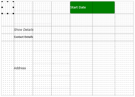
3. The following steps will defined a panel which will display details for each employee, including a thumbnail image. Your completed design will look like the following:
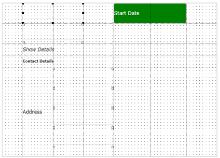
4. Change the panel's Height to 380 and Width to 530.
5. Using the Layout ribbon add a Table Layout with 5 rows and 7 columns.
a. Expand the Rows menu and set the first 4 rows Units to Pixels, which makes them fixed height. The 5th row should remain Units Proportion.
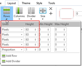
b. Then set the Row Heights as shown:
|
c. Expand the Columns menu and set the first six columns Units to Pixels.
d. Then set the Column Widths as shown:
|
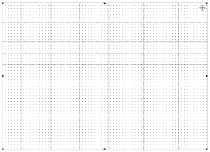
Your design should look like the following:
6. Employee details will be displayed using fields which have their DisplayOnly property set to True.
a. Create a Repository field, of Type NChar, Length 40, Name iiiAddress and Description Employee Address. Open it in the editor and add an Input Attribute of LC (lower case).
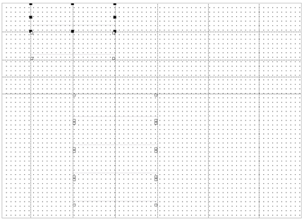
b. Add each field shown in the table and using the Details tab, change Name as shown, change DisplayOnly to True and CaptionType to Caption, which will hide the Caption.
c. As shown in the table:
|
Your design should look like the following:
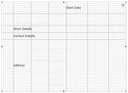
7. Add labels controls as defined in the table:
|
Your design should look like the following:
8. Select the Style ribbon. Select field iiiFullName and change Font to Bold and 9pt.
You have created a local style, Style1 and applied it to the iiiFullName field.
9. Select the MoreLess label. Select the Style ribbon:
a. Change Font to Italic. Style2 was created and applied to the MoreLess label.
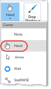
b. Select Cursor = Hand
10. Select the StartDate label.
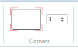
a. Use the Style ribbon to give the label corners with a Radius of 3 pixels:
b. On the Details tab, change ThemDrawStyle to GOOD. This ThemeDrawStyle will be controlled at runtime.
11. Drag and drop an Image component into column 1 in row 1.
a. Change its Name to EmployeeImage
b. Set its Alignment to Center.
c. Set Size to Fit to Width.
d. Set Flow to None.
e. Give it a Margin of 2 on all four sides.
f. On the Details tab, change its ImageSizing property to BestFit.
12. Save your reusable part. It should look like the following:
