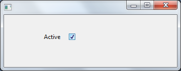
Field Name
ACTIVE (Alpha 1)
Description
How to visualize a field as a Check Box on a form.
Uses
This Visualization type is useful for a Field that is used as a Boolean(TRUE\FALSE).
Through the Field Component source add a Picklist visualization ( PRIM_EVPL ) and a Picklist. Note that these are separate classes in the Field source. Add two picklist items ( Yes and No) to the Picklist and change the Appearance property of the PRIM_EVPL to CheckBox. Save the field and use the VisualPicklist class on a form.
Field Source
Begin_Com Role(*EXTENDS #PRIM_OBJT)
Begin_Com Role(*picklist) Name(#Picklist)
Define_Com Class(#PRIM_PKIT) Name(#Item_1) Caption('Yes') Default(True) Parent(#Picklist) Value(1)
Define_Com Class(#PRIM_PKIT) Name(#Item_2) Caption('No') Parent(#Picklist) Value(0)
End_Com
Begin_Com Role(*Visual #PRIM_EVPL) Name(#VisualPicklist) Appearance(CheckBox) Defaultvisual(True) Height(69) Width(209)
End_Com
End_Com
Form Source
Function Options(*DIRECT)
Begin_Com Role(*EXTENDS #PRIM_FORM) Clientheight(130) Clientwidth(492) Height(157) Left(304) Top(155)
Define_Com Class(#ACTIVE.VisualPickList) Name(#ACTIVE) Displayposition(1) Height(25) Left(160) Marginleft(50) Parent(#COM_OWNER) Tabposition(1) Top(32) Width(129)
End_Com
Appearance

Clicking the check box will set the corresponding value for the field from the picklist items. Values are chosen from the following rule: