This section describes basic Visual LANSA controls. The controls are components which the user can use to control the application.
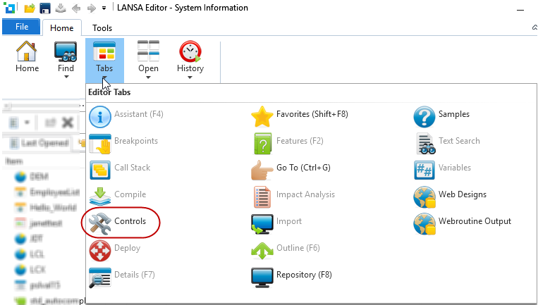
To display the Controls tab, on the Home ribbon, select Tabs, then Editor tabs:

The use of most Visual LANSA controls is straightforward. For example, if you want to use an image in your program, drag the image control to your form and specify the file name of the picture. However, some controls are more complex. This section provides an introduction to these controls. For more detailed information, use F1 to access the Help for the control. The Help describes the component which is currently selected in the editor.
The Controls tab can display the controls in a Windows view (as follows) or the Material Design view.
|
2.9.12 Picture and Sound Controls 2.9.9 Tab Folder and Tab Sheets Also see 2.10 Lists, Tree Views, Grids and Graphs
|
|