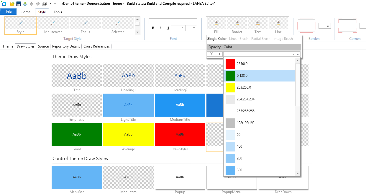
For User Interface design, and in particular the use of colors, the 'Keep It Simple' mantra is definitely one to adhere to. For most applications, a simple color scheme with only a few different colors will be more than enough.
Colors
The default Themes have 12 or so colors defined for them, but in practice only about a third are actually used, along with white for the background and gray for disabled or inactive state. The background color for the Dark Title Draw Style is the same color used for the text color of the headings and Light Title. Similarly, the MouseOver color for PushButton is that same as that of Toolbar button and Menu item, as well as being used for the selected list item color.
When applying your own colors, perhaps those of a corporate nature, it is recommended that you leave the base colors unchanged and instead simply reuse a color as required. It may seem desirable to change the base colors, but practice has shown that this more pragmatic approach simplifies maintenance in the long run.
To help with the definition, LANSA keeps track of colors already used.

When the color dropdown is opened any colors used will appear at the top of the list, above the base set of colors. As soon as the last use of the color is removed, it will no longer appear in the list.
Draw Styles
As with colors, keep it simple. Fewer Draw Styles will result in a far more consistent and pleasing User Interface.
It is worth remembering that Draw Styles can be combined at design time, so there is no need to make many variations of text size and backgrounds.
As with colors, lots of different fonts and font sizes are rarely required. For simplicity, it is recommended that you pick a base font size for the majority of your text and use percentage sizing for headings so that any change remains proportional to the base font used.