Slide in panels are most often used to present commonly used features to a user without using up screen space until they are required. They slide into view when required, then slide out of view when no longer required.
A VLF-ONE Framework may have left, right, top or bottom slide in panels.
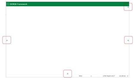
The presence of a slide in panel is indicated by expansion images on the top, left, right and bottom edges of the web page:

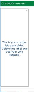
As the user mouses over the edge it is highlighted, like this left edge slider:

If the user clicks or touches the highlighted edge, the slider appears:

A slider can be docked, or undocked by the user.
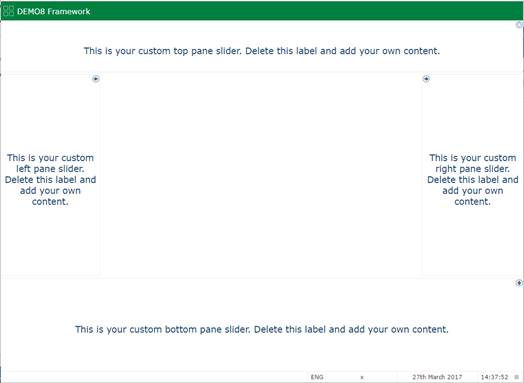
This Framework has a slider attached to all four edges and all four have been docked:

Slide in panels are specified using the VLF-ONE Slide In Panel Reusable Part properties.