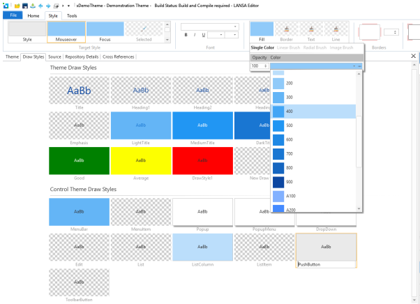
Draw Styles
A Draw Style is a set of one or more styles that are applied via the ThemeDrawStyle property of a control. There are two variations Draw Styles.
Theme Draw Styles are abstract Draw Styles that can be used wherever it is appropriate. Title, Heading 1, 2, 3 and so on, are predefined names that exist by default in all basic System Themes. They have no particular meaning as such, other than to provide a set of basic Draw Styles that will exist in every Theme. These must be applied when developing the application.
Control Theme Draw Styles apply specifically to the default appearance of controls. Thus, the Edit Draw Style applies to all input boxes such as fields and spin edits; list Item applies to all entries in the List control; menu item applies to menu items, PushButton applies to Push-Buttons and so on. These apply automatically with no additional developer input.
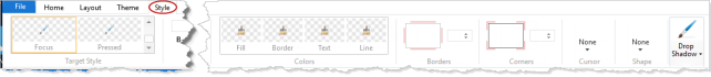
There are seven features of a Draw Style.
-
Style is the visual style applied to the Style property of the control:
-
MouseOver is the visual style applied to the MouseOverStyle property of the control
-
Focus is the style applied to the control when it becomes the Focus control or the list FocusItem.
-
Selected is the visual style applied to a list item when it is selected.
-
FocusInactive is the style applied to a list item when it is the focus item but the list it not the focus control.
-
SelectedInactive is the style applied to a list item when it is selected but the list it not the focus control.
-
Pressed is the style applied to a control when the left mouse button is down.
So, to change the default MouseOver color for all push-buttons in an application, you simply select the PushButton Draw Style and the MouseOver style, and then set the Fill color.