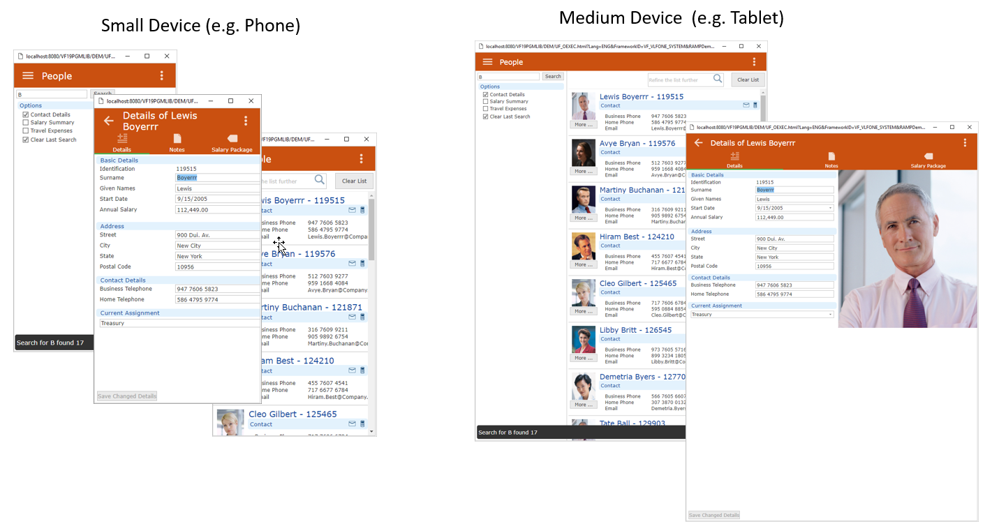

EPC141081 introduces the start of evolving support for small (e.g. phone sized), medium (e.g. tablet sized) and large (e.g. desktop) sized devices in VLF-ONE applications.

This feature is being released for use with LANSA V14 SP1 systems, but the small and medium device support is expected to significantly evolve further with the release of LANSA V14 SP2.
This change impacts existing VLF-ONE applications because it changes how 'tablet mode' now appears and navigates. The new large device support also introduces the Google Material Design style execution for existing desktop VLF-ONE applications.
Only powerful late model, mass market iOS and Android mobile devices are supported.
See:
Controlling Content Based on Device Size
Navigation in Google Material Design User Interface
Sometimes Things Just Won't Fit into a Smaller Screen